
MID-MOVIE SNACK DELIVERY
WEBSITE DESIGN
Google UX Design Course Case Study (Adobe XD)
The product:
I created a movie theatre website (Jackson Cinema) that offers mid-movie snack delivery. Users can order movie snacks to be delivered to their seats in the middle of the movie. The typical users are adults.
Project duration:
November 2021 - February 2022
Project Overiew

The problem:
Users didn’t want to stand in line to order snacks when they arrive at the movies. Also, users may want snacks in the middle of a movie so they would have to leave their seats, stand in line to purchase snacks and miss part of the movie.
My role:
UX designer leading the Mid Movie Snack Delivery website design
Responsibilities:
Conducting interviews, paper and digital wireframing, low and high-fidelity prototyping, conducting usability studies, accounting for accessibility, iterating on designs and responsive design.
The goal:
The goal is to create a website where users can not only order snacks online but choose to have their snacks delivered to their seats after the start of the movie
User research: summary
I conducted an unmoderated user study. I discovered most users would utilize this feature of order snacks mid-movie if it was available. This would save users time from standing in long lines before the movie starts but also provide convenience if they want snacks in the middle of the movie without leaving their seats.
I also conducted a competitive audit of other movie theatre websites that offer mid-movie snack delivery. Some movie theatres had extensive information about ordering snacks while some have very limited information like a brochure. Only a few offered to have snacks delivered to the user’s seats but not mid-movie.
User research: pain points
Navigation
Some movie website designs are often make it difficult for users to know if they can even order snacks ahead of time.
Experience
Many movie theatres do not provide snack delivery let alone mid-movie.
Interaction
Purchasing tickets and seats can be confusing depending on how the selection screen is set up.

Persona:
Nicole
Problem statement:
Nicole is an avid movie-goer and snack enthusiast who needs an app to order snacks and have them delivered to her seat mid-movie because she does not want to miss the movie by leaving her seat to go to the counter.

Difficulty with selecting seats and purchasing tickets was a primary pain point for users, so I used that knowledge to create a sitemap.
My goal here was to make sure that users could easily purchase tickets and select seats on in the same area. The structure I chose was designed to make things simple and easy.
Sitemap

Paper wireframes
Next, I sketched out paper wireframes for each screen for my website, keeping the user pain points about navigation, browsing, and checkout flow in mind. But as I started getting developing the site more, I realize I need to make further changes to my design.


Paper wireframe screen size variations
Because the mid-movie snack delivery users access the site on a variety of different devices, I started to work on designs for additional screen sizes to make sure the site would be fully responsive. Again, I ended up making further changes in my design.

Digital wireframes
Here is where the redesign started to take shape. Moving from paper to digital wireframes made it easy to understand how the redesign could help address user pain points and improve the user experience. Prioritizing useful button locations and visual element placement on the home page was a key part of my strategy.

Here’s the home page for web and mobile.

Mid movie snack delivery is prominent and given the highest in the hierarchy. ——->
Movies now playing are prominent. ——>

Low-fidelity prototype
To create a low-fidelity prototype, I connected all of the screens involved in the primary user flow of adding tickets, seat selection, and snacks to the cart and checking out.
At this point, I received feedback on my designs from members of my team about things like the placement of buttons and page organization. I made sure to listen to their feedback, and I implemented several suggestions in places that addressed user pain points.
Mid Movie Snack Delivery Low-fidelity prototype

Usability study: findings
Checkout
Users needed a confirmation page.
Ticket/Seat Selection
Users found the location of the seat and ticket selection confusing.
Movie Time Selection
Movie time selection was confusing and the user didn’t know if they were picking the right days.
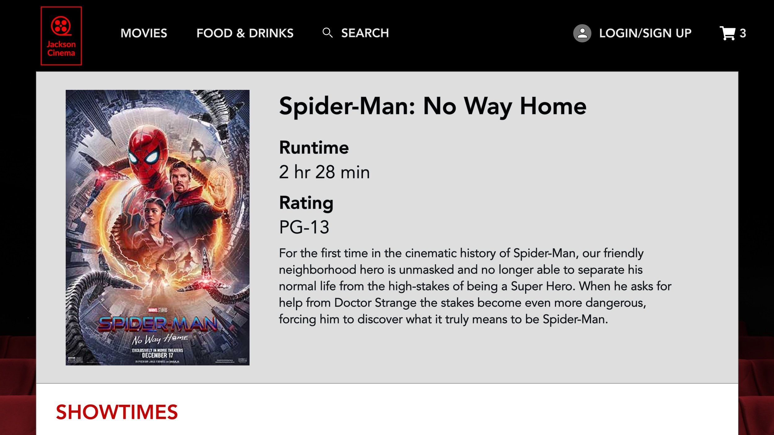
Mockups
Based on the insights from the usability study, I made changes to improve the homepage. I made the text hierarchy clear and also added the “MORE INFO” button as a call to action.
Some users thought that purchasing the tickets and seat selection were confusing because of the layout. I then moved the seat selection and ticket purchase above the fold.


Before usability study
After usability study

After usability study
Mockups: Original Screen Size


Mockups: Screen size variations
I included considerations for additional screen sizes in my mockups based on my earlier wireframes. Because users shop from a variety of devices, I felt it was important to optimize the browsing experience for a range of device sizes, such as mobile and tablet so users have the smoothest experience possible.


High-fidelity
prototype
My hi-fi prototype followed the same user flow as the lo-fi prototype and included the design changes made after the usability study, as well as several changes suggested by members of my team.
View Mid-Movie Snack Delivery's high-fidelity prototype

Accessibility considerations
I used headings with different-sized text for a clear visual hierarchy.
The colors scheme passed the usability test for different visibilities.
The user has different ways to return to the previous screen, home screen, and profile.
Takeaways
Impact:
I would hope that users would take an advantage of a website like this just for convenience. A movie theatre that offers this type of service is bound to increase ticket and snack sales.
What I learned:
While designing the mid movie snack delivery website, I learned that putting the user first is a priority. Usability studies and peer feedback influenced each iteration of the website’s designs.
Next steps
Conduct another usability study for more improvements.
I would like to further investigate what kind of snacks are available for mid-movie delivery: popcorn and candy vs a heavier meal.
I would also like to further investigate what types of theatres offer mid-movie: a large/chain theatre versus a smaller/niche theatre.