
GET INVOLVED LOCALLY WEB APP
Google UX Design Course Case Study (Figma)
Project Overiew
The product:
Get Involved Locally (GIL) web app provides a way for people to volunteer their time and talents to their local organizations. People can volunteer either in person or virtually. They can also schedule the dates they are available.
Project duration:
February 2022 to May 2022

The problem:
People are busy yet they want to be able to help others but may not know where and when they can.
My role:
UX designer leading the app and responsive website design from conception to delivery.
The goal:
Design a web app that will allow people to choose how and when they volunteer based on their location..
Responsibilities:
Conducting interviews, paper and digital wireframing, low and high-fidelity prototyping, conducting usability studies, accounting for accessibility, iterating on designs, determining information architecture, and responsive design.
User research: summary
I used GIL’s data on volunteering to develop interview questions, which were then used to conduct user interviews. Most interview participants reported that they usually just show up to volunteer service or they find out about it through a friend. The feedback received through research made it very clear that users would be open and willing to schedule dates where they know for sure when and where to be and are also given the opportunity to make an impact virtually.
Persona:
Addison
Problem statement:
Addison is a working mother with 2 children who need to find a way to sign up to volunteer because he wants to be able to either volunteer by herself or with her family.

Persona:
Jacob
Problem statement:
Jacob is a worker with a pet who needs to find a way to sign up to volunteer because he wants to be able to schedule time around his unusual work schedule and meet new people.

Competitive audit
An audit of a few competitors’ products provided direction on gaps and opportunities to address with the GIL’s web app.
Ideation
I did a quick ideation exercise to come up with ideas for how to address gaps identified in the competitive audit. My focus was specifically on offering more than one way to view volunteer opportunities.

Digital Wireframes
After ideating and drafting some paper wireframes, I created the initial designs for the GIL app. These designs focus on offering more than one way to view volunteer opportunities.

Eventually, I added descriptive text to the search box.
Added a calendar page
Clicking on either buttons will take you to all the opportunities listing.
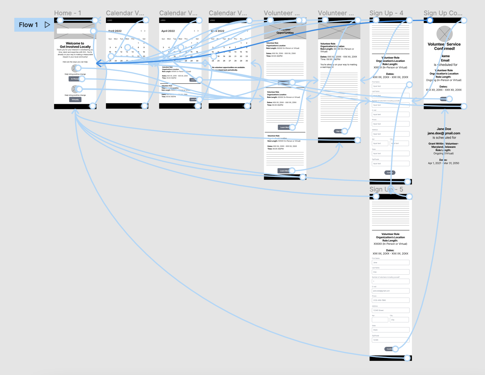
Low-fidelity prototype
To prepare for usability testing, I created a low-fidelity prototype that connected the user flow of viewing an volunteer opportunities.
Usability study: findings
Most of the users preferred using the search bar over the buttons on the homepage.
Most users found that the user flow was straightforward but there was some confusion about using the calendar.
Users found that the sign up form asked for too much information.
Based on the insights from the usability studies, I applied design changes like providing a clear prompt in the search bar and adding a little more information on the homepage instead of creating another “About Me” page. I also used cards instead of just icons and buttons for more visual clarity.
Mockups
Before usability study


After usability study
Additional design changes included reducing the amount of fields a user had to input in order to sign up. Most felt as though they shouldn’t have to provide all of that information and needless scrolling.
Before usability study

After usability study

High-fidelity
prototype
The high-fidelity prototype followed the same user flow as the low-fidelity prototype, including design changes made after the usability study.

Accessibility considerations
Clear call to action labels.
Text and background colors passed the contrast ratio.
Provided more than one way search and to return to previous screens.
Sitemap
With the app designs completed, I started work on designing the responsive website. I used the GIL sitemap to guide the organizational structure of each screen’s design to ensure a cohesive and consistent experience across devices.

Responsive designs
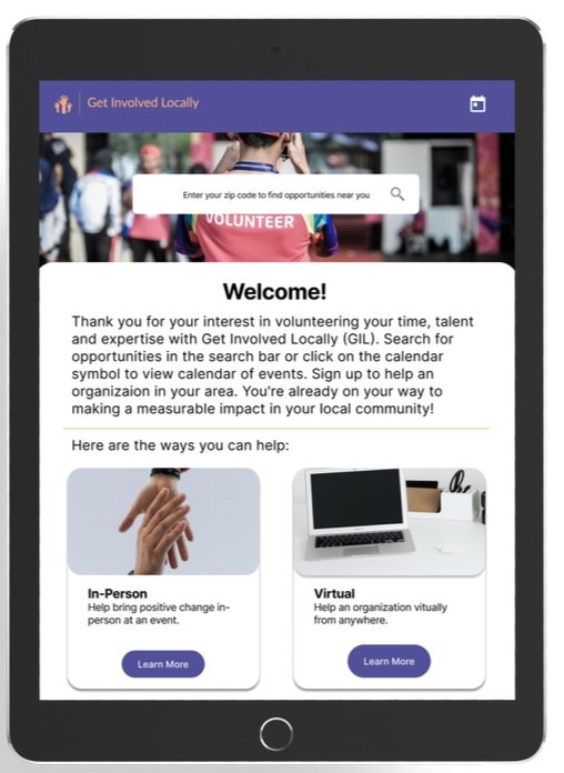
The designs for screen size variation included mobile, tablet, and desktop. I optimized the designs to fit the specific user needs of each device and screen size.

Mobile Site

Tablet

Desktop
Impact:
Most users during the study agreed that the web app was easy to use. I think providing users with more than one way to volunteer will increase help for organizations. One user stated, “...easy and love the idea for this app!”
Takeaways
What I learned:
I learned quite a bit about scaling between different devices. There were some challenges but I was able to figure out a solution to cut down on time. Going through this process helps me figure out solutions for users.
Next steps
Conduct user research on how many people signed up and actually volunteered and see if they would use this process again.
Add more educational resources for users to learn more about the organizations they are volunteering.
Provide more search options based on their preferences (ie. pets, children, outdoors, etc.)